What Do I Need to Create My Own Website
Setting up your own website is much easier than you think. More and more people want to have their own online presence. You don't need to depend exclusively on an Instagram profile, a Facebook page, or a Twitter account.
Why not create your own website?
To get started, let's take a look at the most common questions we received from ambitious beginners like yourself in the past:
Will I need technical skills?
This depends on the purpose of your website. The most complicated way would be to learn how to code HTML, CSS, JavaScript and PHP – the basics of practically any website.
But this isn't the only way to create a website: even if you aren't very familiar with the technical side of things, you can easily set up a good website.
But how?
By using a Website builder. If you can use Word, Facebook, or PowerPoint, you'll be able to use these tools without any problem. These easy-to-use platforms offer a visual editor, hosting, and you can get a domain name through them: a one-stop-shop.
How to set up a website: 5 steps to get started
Most website projects go through these steps:
- Make a plan for your website's structure and content
- Register a domain name – ideally pick a .com
- Find a website builder (or CMS/hosting provider) to create your site
- Optimize it for search engines
- Launch your website
The 3 most popular ways to set up a website
Let's go over the most popular ways to start a website. There are many solutions. Some are more flexible than others, and some are more complex.
Setting up a website with a website builder
Let's start with the easiest option: a website builder. This is an "all-inclusive" package, so to speak: a single company will usually provide the template (design), editor, hosting, domain name, email address and support. The web builder takes care of the difficult tasks.
Smart Finder: Quickly find out which is the best website builder for you
What's the Best Website Builder for You?
This isn't only useful for beginners. It simply depends on the project. Why complicate your life if there are easy ways to do things? Almost all site builders let you create a free basic website on a subdomain (e.g. yourname.sitebuildername.com), which is ad-supported. Using such a plan you can try it in detail before deciding if the cost is worth it.
Prices start at around $8/month, but it includes all the essentials. Add around $1-6/month on top if you need a professional email address.
To better understand exactly how it works, please watch our step-by-step tutorial to website creation!
Ever wondered how difficult it is to create a website? We have some good news, it's very easy! Check out our full tutorial here: ... How to Create a Website? Learn It in Less Than 5 Minutes! 2018-08-09T09:41:25.000Z https://i.ytimg.com/vi/FXNSB-XmtLY/default.jpg
Pros:
- It's very easy to use.
- You don't need additional software or even hosting.
- You can start without technical knowledge.
- Updates and security aspects are handled by the website builder company.
- Predefined design templates that you can adapt as you like.
- Mobile-optimized version included by default.
Cons:
- You can't always add extra features (depending on the website builder).
- It isn't as flexible since you're dependent on the provider.
- They aren't designed for very complicated projects that require a database (e.g. a job board or real-estate directories)
The best-known website builders are Wix (see tutorial), Squarespace (see tutorial), and Shopify (for online stores). You'll find other Website builders in our complete comparison.
You can try the Wix website builder for free and for as long as you want.
Try Wix free
Creating a website with a content management system
Content management systems (CMS) are a bit more complicated. Even though they essentially work the same way as a website builder, they are far more difficult to use.
With a website builder, not only can you add simple content like texts and images, but you can also design an entire website. A classic content management system would be much more limited in this case, and as far as appearance goes, you're limited to the templates available.
While there are plenty of systems like Joomla!, Drupal and Typo3, we'll focus on the most popular CMS, which is WordPress. Thanks to hosting companies that offer a one-click install, it's not difficult to set up.
Recommendable ones are Dreamhost (extremely affordable), Siteground (a bit more expensive but super powerful) and Bluehost (popular choice with 24/7 support).
Learn more about which web hosting companies we recommend for WordPress here.
You can also install a template easily and adjust it with the design options. But: if there is something you don't like, you'll probably have to modify the CSS or HTML (you or a programmer).
The hosting, domain, email address, installation and level of support you choose will depend on how much you want to spend and your technical knowledge. It can be quite cheap if you do it yourself. Take a look at our pricing guide for typical website projects here.
Of course, that may not always be the ideal solution, especially when you're busy running a business. In this case, you can also try to hire a web designer who can help you set up a WordPress website, for example.
An enormous advantage, especially for WordPress, is that you have thousands of plugins that let you add special features to your website that are not initially included. A typical example would be WooCommerce, a plugin that adds a complete online store.
By default, WordPress is designed to be in a single language, but there are plugins, like WPML, that let you translate the page. Another of my favorites is the Yoast SEO plugin, which lets you change the search engine settings (e.g. to rank higher on Google).
In our introductory video, we take a look at what you need to consider if you're setting up WordPress.
Let's quickly check how to install WordPress using SiteGround's hosting. SiteGround is one of the top hosting providers for WordPress sites. You can try ... Learn How to Install WordPress with SiteGround's Hosting 2019-10-23T07:54:23.000Z https://i.ytimg.com/vi/XMLMT_mKZhQ/default.jpg
You can sign up for Siteground here.
Pros:
- You can choose the hosting company.
- Great for multi-language websites.
- Technical flexibility: you can access the whole source code (if you know what you're doing).
- You can get more features with plugins.
- You can optimize your page loading speed
Cons:
- No direct personal technical support (only limited support from your web host)
- Creative freedom depends on the template.
- It can have additional costs for the plugins.
- You may need a programmer even to make small aesthetic changes.
Other examples of content management systems are Joomla! And Drupal, but they are far more complicated to use than WordPress, so we won't get into that. You'll find more information on WordPress in our WordPress beginners guide.
How to program a website yourself (or hire someone to do it).
This is the supreme discipline: opening the editor and starting to code. Those who need total liberty will have to make the page themselves. You do need patience for this, and for beginners, it is usually overwhelming (and frustrating).
A good place to start are websites like Codecademy, Mozilla, or W2Schools, which have step-by-step tutorials for beginners. But expect a long journey before your website is ready.
In this case, it is not possible to give a price in general, since it depends on the project. Above all, it will be much more expensive if you need to hire a programmer: paying the $8-10 a month for a website builder will always be cheaper than what any designer or agency will charge for an hour of work.
Some favorites are NetBeans, Aptana Studio or Brackets. All allow at least HTML, CSS, JavaScript, PHP, and are free. Another option is Webflow, which is a visual source code editor.
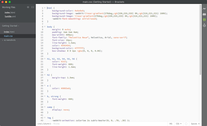
Brackets screenshot
Pros:
- The possibilities are unlimited if you know how to program.
- Cost-friendly hosting.
- Maximum flexibility.
Cons:
- No support.
- The learning curve is steep.
- The costs are hard to calculate.
- Requires a lot of study and implementation time.
What about the domain name?
If you don't want to use a free domain name (which looks quite ugly as it will have the name of another company in it), you need to purchase your own domain. This will then look likewww.mycompany.com. Usually, it's best to get the .com extension unless you are strictly operating in one country like Canada (.ca) or the UK (.co.uk). Of course, there are also many successful businesses that use one of the newer domain names like .me or .agency, for example.
![]()
Our own domain name
There is no shortage of so-called registrars that sell domain names. We ourselves mostly buy them at Namecheap as they are, well, pretty cheap but the differences are not that significant as they range from $9-18 per year.
But depending on where you build your website, you can get it also included in your website builder package. Wix, Weebly, and Jimdo, for example, all have the domain name included for free in the first year. The following years they charge slightly more than Namecheap, for example, but the added convenience of only having to deal with one company is normally worth it.
If you are using WordPress.org or build the website yourself, you will also need to organize your own web storage. This can be bought at the same place where you get your domain name from or at yet another specialized company like Siteground or WPEngine. But if you are only starting out, this won't matter too much for now.
Let's now look at an area that is closely connected to the domain name:
How to get a professional email address?
If you're running a business, you likely don't want to use a Gmail or Hotmail address. Having an email address on your own domain name looks much more professional! And it's pretty easy to get. Let me give you a few different options:
- Get it from your website builder or web hosting company: a few of them include email addresses at no extra cost (e.g. Webnode and Siteground)
- Get it from your domain registrar: Namecheap, for example, offers it for less than $12 per email address per year.
- If you love Gmail, you can try Google Workspace. It's the most feature rich solution, but will set you back $6 per email address. This is also the solution most website builders offer (Wix, Squarespace, Jimdo etc.)
- Tip: For a completely free solution: Zoho Workplace, which includes up to 5 email addresses. It's a little bit more complicated to set up but your domain registrar should be able to help you with that.
Design and planning of a website
Just like it isn't always a good idea to start cooking without following a recipe, at least if you have no experience, the same goes for creating a website. Here, improvising is not a good idea. Planning will help you decide what sections you need, the content that works best for you and how your website should be designed.
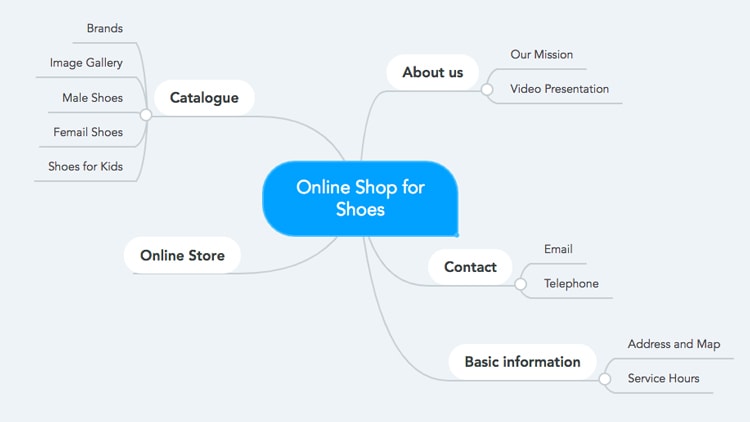
Mind map for an online shoe store
A good way to start is by creating a mind map with the ideas of what your website will need. The main items of this mind map can be used for your navigation.
Tips for planning your website:
- Use a paper and a pen and write down everything you want on the website. Brainstorming and creating a mind map are the perfect ways to organize your thoughts.
- Take a look at other interesting websites both in terms of design and content. Note what you like and what you don't.
- Once you have a draft of what you want on your website, ask people you trust what they think. You'll certainly find some interesting perspectives you can incorporate.
- Create a list(e.g. in Excel) with all the pages that your website will have. Note down the title, what kind of content you'll have, keywords, the purpose, the kind of page and their importance.
- Bonus: If you want to position yourself well in search engines, this is when you should find out what keyword each page will have, and add them to the list in point 4. Read this SEO guide for more information.
What about the website design?
Creating visual web designs is no easy task. In fact, I'd say that online, there are more examples of terrible designs than good ones. Don't let your website be one.
Just like bell bottom jeans were stylish in the 70s, they were ridiculous in the 80s and 90s. The same happens with web design. You have to remember that what was considered good practice 5 years ago, can now seem kind of old or out of date. Check out this article to know what practices to avoid.
This is not a guide for professional designers, but it will give you some tips that I think always work:
- Try to use a light (or white) color for the background.
- Choose attractive colors that complement each other. Use Adobe Color if you need help.
- Keep the design clean, simple, and leave white space between the elements. More information.
- Don't use too many fonts: one for the titles and another for the text is usually enough. This guide will help you choose.
- Keep consistent style and format. The users should not notice any differences between your pages. Don't create a Frankenstein.
- Your website should also be perfectly adapted to mobile devices.
- Any images you add must look professional. Don't upload a selfie you took in front of a bathroom mirror. Keep in mind that today's smartphones take very nice photos. If you plan right, you can get great headshots.
- Less is more. When in doubt, go minimal.
If you want to go deeper with the web design, take a look at Wix's blog. There have infinite tutorials and guides on easy-to-digest designs.
What elements do good websites have in common?
1. Great-looking artwork
The logo and image selection are crucial to getting a professional-looking website. Today you can easily find loads of free stock photos: the best ones to check out are Unsplash and Creative Commons.

What's more, you can find more professional-looking photos (starting $1) on a lot of other websites, like Depositphotos and Shutterstock. Here are some great free photo options.
It is important to make sure you understand the available image formats: .gif, .jpg and .png are the main formats. Plus, you have to optimize the size and quality of the image to the web standard browser. Everything you need to know about this topic can be found here.
Before uploading images to your site, use services like TinyPNG or ShortPixel to compress your photos for free. Although the human eye will hardly recognize any change in the image, it will speed up your website and improve the user experience for your visitors. Of course, search engines love fast loading websites too!
Likewise, it will come in handy to have an editing program to be able to edit and change the size of the images. A professional and free option is Gimp, however, it's quite complicated to use. Other Photoshop alternatives are Affinity Photo and Acorn, which costs only a fraction of the price of the original and doesn't require a subscription.
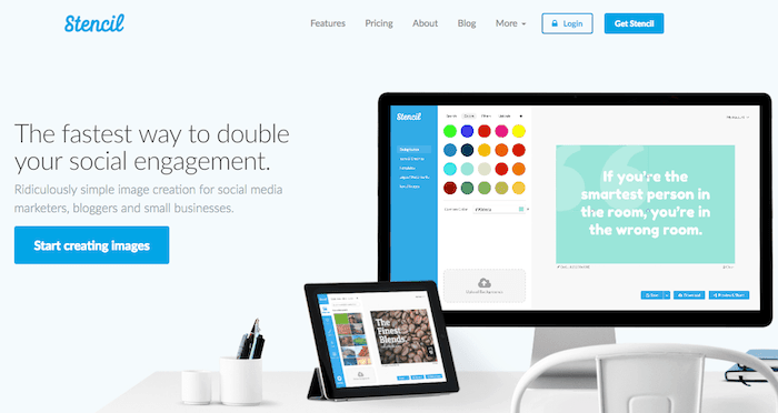
But there are increasingly more tools you can use to create graphic resources simply and without having to learn to use Photoshop or Illustrator. For instance, you can use Stencil or Snappa.
2. Professional copy
Remember that writing for a website isn't the same as writing a letter or a book. On the web, we tend to be less formal and at the same time need to help busy individuals find the information they need quickly. That means we have to make our content scannable by:
- using a headline structure that makes sense,
- not letting the text paragraphs get too long,
- adding bullet points and
- choosing fonts that are easy to read.
We've actually written an entire guide around this topic, which you can find here.
3. Contact form and a navigation menu that makes sense
To give a professional impression to your visitors, you should use a contact form instead of an email address. Fortunately it is straightforward to integrate contact forms with solutions like Wix, Squarespace or WordPress.
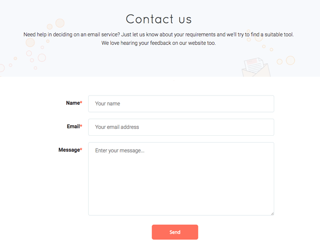
Remember that your website's navigation bar is crucial for visitors to go from one page to another. Pay attention to it and make sure it flows logically. For example, if your objective is for users to send you a message through the contact form, forgetting to link to it in the menu or page footer would be an epic fail.
Make sure you also do a test sign up before publishing your website!
Steps for setting up a website
We can break down the website creation process into the following steps:
- Plan your website and order the ideas in a mind map.
- Decide what content you need for your website.
- Buy the domain name, for example at Namecheap (but you can also buy it after).
- Choose the best website builder.
- Create the content (e.g. texts and images) for each page.
- Add the content to your website and optimize the SEO.
- Publish and promote the page.
Obviously, each of the above points can be built on much more. We have a (free) ebook where you can get more information.
Your website is up. Now what?
If you've already created your website and published it, you can start promoting and optimizing it to increase visits and improve the user experience.
- Update your website: Websites are not books. Once published, they can still be updated. Make sure that you create new and relevant content when you have the chance and that you're constantly updating the website. For example, imagine a restaurant's website: if the menu changes, it should be reflected on the website as quickly as possible.
- Online positioning: To attract as much visitors as possible, you'll have to optimize your website's SEO. This is not very complicated but it requires time and work. Check out this guide for more information.
- Web analysis: Your efforts in online positioning (above point) will be useless if you don't measure your website traffic. That's how you'll know whether it's working or not. The most popular website analysis tool is Google Analytics. And it's free!
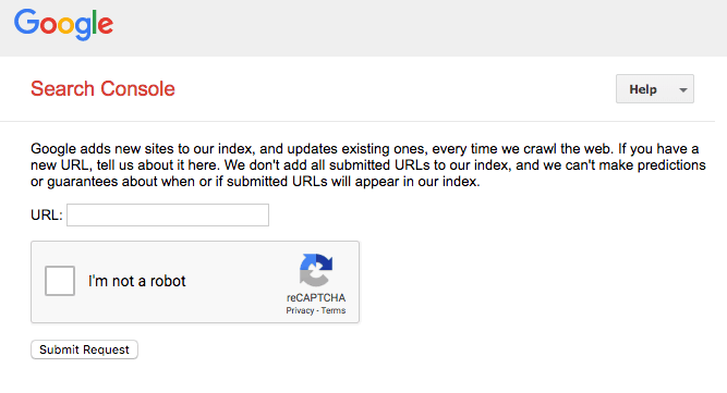
- Of course, once you publish your website, you should register with Google Search Console to notify Google that your page exists and get information. Or at least send your website's URL (address) to Google so that it can index it.
- Email Marketing: Another usual strategy, especially for businesses, is to send regular emails to its visitors not to lose contact. This is especially useful for online stores, small businesses, and bloggers. Email marketing is a science in itself. You can read this how-to guide to find more information on how to get started sending newsletters.
- Social media: Finally, most websites also have social media profiles (e.g. Facebook, Instagram, Twitter, LinkedIn, etc.) to be able to interact with their visitors (and potential visitors) outside of the website you've created. This works especially well for visual professionals, like illustrators, jewelers, or photographers.
I hope that this small guide has helped you understand how to create a website from start to finish.
Next to the guide you were reading just now we also have a couple of industry-specific guides as well:
- Setting up a website for small businesses and entrepreneurs
- Guide for starting an online store
- Website builders for artists (e.g. artists and designers)
- How to create an online portfolio
- Creating photography websites
- Create a website with WordPress
If you have any questions on how to start, leave a comment below, and we'll try to help.
Latest updates:
13 Oct 2021: Checked for accuracy, email address update
What Do I Need to Create My Own Website
Source: https://www.tooltester.com/en/how-to-set-up-my-own-website/
0 Response to "What Do I Need to Create My Own Website"
Post a Comment